Analytics & Dashboard — Turning Data into Actionable Insights
Analytics & Dashboard — Turning Data into Actionable Insights
🎯 Overview
After building the data pipeline and alert system, the final step is to transform data into actionable insights.
This post focuses on:
- KPI design
- Dashboard structure
- Insight generation
- Visualization using Metabase
🏗️ Analytics Architecture
1
2
3
4
5
6
7
8
9
10
11

[InfluxDB (Raw Data)]
        ↓
[Python Aggregation Layer]
        ↓
[MySQL (Summary Data)]
        ↓
[Metabase Dashboard]
        ↓
[User Insight]
🧠 KPI Design
A dashboard is only as useful as the KPIs it presents.
Core KPIs
| Category | KPI |
|---|---|
| System | CPU Usage, Memory Usage |
| Thermal | Avg Temp, Max Temp |
| Hardware | Fan Speed Stability |
| Power | Avg Power Consumption |
Derived KPIs
- Temperature Spike Frequency
- Fan Failure Count
- Power Usage Trend
- System Stability Index
📊 Dashboard Structure
We design the dashboard in layers:
1. Overview Dashboard
Purpose:
- High-level system status
Includes:
- Current CPU / Temp
- Alert status
- Overall system health
2. Trend Analysis Dashboard
Purpose:
- Identify patterns over time
Includes:
- Temperature trend (daily / monthly)
- Power usage trend
- CPU usage trend
3. Detailed Analysis Dashboard
Purpose:
- Drill-down into specific metrics
Includes:
- Per-host analysis
- Metric comparison
- Time-based filtering
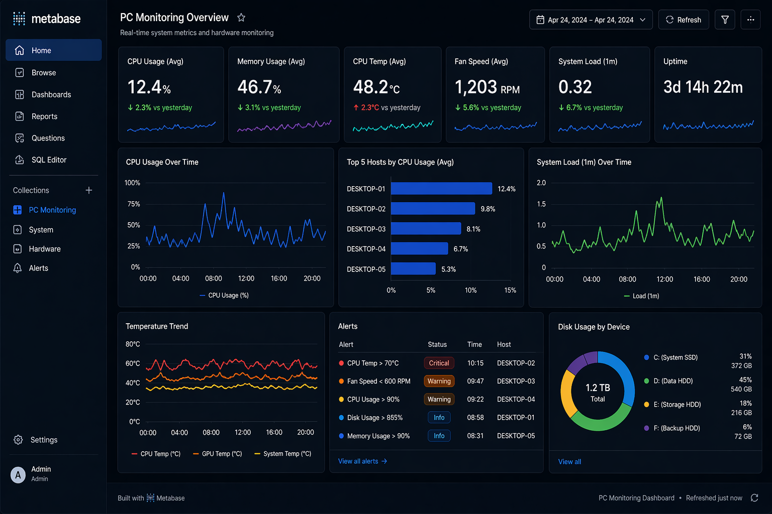
🖼️ Dashboard Example
📡 Metabase Setup
Data Source
- Connect MySQL
- Use aggregated tables
Example Tables
- device_summary_hourly
- device_summary_daily
📊 Example Queries
Daily Average CPU
1
2
3
4

SELECT date, avg_cpu
FROM device_summary_daily
Max Temperature
1
2
3
4

SELECT date, max_temp
FROM device_summary_daily
🧠 Insight Generation
Example Insights
1. Temperature Pattern
- Gradual increase → cooling issue
- Sudden spike → workload anomaly
2. Fan Behavior
- Stable → normal
- Sudden drop → hardware issue
3. Power Usage
- High + stable → expected load
- High + irregular → anomaly
🎯 Insight Examples
1
2
3
4
5

"CPU temperature increased by 15% over 3 days"

"Fan speed dropped below threshold twice in 24 hours"
🔍 Drill-down Analysis
Workflow
1
2
3

Overview → Trend → Detail
Example
- Detect high temperature
- Drill down to hourly data
- Identify root cause
⚖️ Design Principles
1. Simplicity
- Avoid clutter
- Focus on key metrics
2. Actionability
- Every chart should answer a question
3. Consistency
- Same scale and units
⚠️ Common Mistakes
❌ Too many charts
- Leads to confusion
❌ No context
- Data without interpretation is useless
❌ Mixing raw and aggregated data
- Causes inconsistency
🎯 Key Takeaways
- KPI design is critical
- Dashboards should guide decisions
- Insight > visualization
🚀 Next Step
In the next post, we will explore:
- System optimization
- Performance tuning
- Scaling strategy
This post is licensed under CC BY 4.0 by the author.